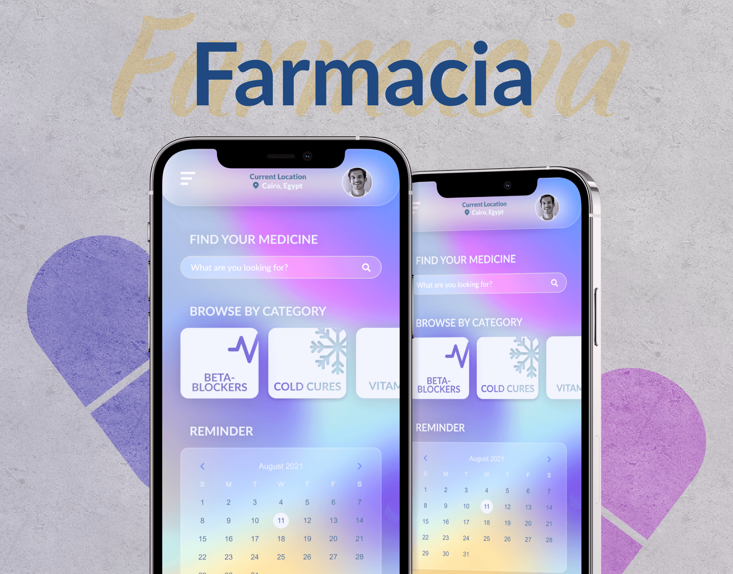
Farmacia - Medical Mobile Application
Farmacia - Medical Mobile Application
Farmacia - Medical Mobile Application
Personal Project
2 weeks
Mobile Application
Personal Project
2 weeks
Mobile Application
Personal Project
2 weeks
Mobile Application


About
Well, look who's stumbled into the wacky world of my UX! Are you here for the laughs or just accidentally click the wrong link? Regardless, get ready because I'm about to share the exciting journey of learning UX.🚀🚀
Imagine me, a brave soul with the UX knowledge of a potato, facing the digital wilderness armed with nothing but a keyboard and a questionable sense of style. It was like trying to juggle flamingos – entertaining, but things might get messy.🦩
Let me start with Farmacia flaws! It was like my project had more holes than a slice of Swiss cheese. It was like trying to knit a sweater with spaghetti – messy, confusing, but oddly entertaining. I call it "abstract design," and it's all the rage in imaginary art galleries. 🎨
Accessibility issues? Oh, I had more accessibility roadblocks than a GPS with a hangover. It was like navigating a maze blindfolded but with extra bananas and slippery slides. Spoiler alert: I slipped a few times.
Now, let's talk about the learning curve. If the learning curve were a mountain, I climbed Mount Everest blindfolded, with one hand tied behind my back. But hey, I made it to the summit, frostbite and all! This project wasn't just about UX/UI; It broke the cycle of creating something, only to put it in the drawer or abandon it halfway.
Sure, it might be a bit rough around the edges, like a diamond in the rough, but it's MY diamond, and I'm polishing it with pride. This whole experience is a reminder to myself that even when the going gets tough, and the pixels are against you, you can emerge victorious.
So, here's to the project that taught me more than any textbook ever could. Here's to embracing flaws, navigating accessibility mazes, and turning cluelessness into competence. I'm grateful for the wild ride that was my UX initiation – may my UX adventure be remembered as the epic quest of digital mayhem!
Other Projects
© Copyright 2023. All rights Reserved.
© Copyright 2023. All rights Reserved.

